An introduction to antigenic cartography
Source:vignettes/intro-to-antigenic-cartography.Rmd
intro-to-antigenic-cartography.RmdIntroduction
Here we aim to give a brief introduction to antigenic cartography, the steps taken to convert a table of titer data to an antigenic map, the potential advantages of doing so, and the potential drawbacks.
What is an antigenic map?
Firstly, an antigenic map takes titration data that measures strength of reactivity of a group of antisera (sera where an immunologically naive animal has been infected with a single antigen) against a group of antigens (usually simply different pathogen strains).
The classic example for which cartography was developed was tables of HI titers measuring ferret antiserum reactivity against different influenza strains, but the same approach has also been used for other assays such as the FRA or HINT assays, and other pathogens, such as dengue.
In the actual map itself, different antigens are typically represented as solid circles with straight-line distances between them representative of antigenic similarity, hence antigenically similar strains should appear close to each other on the map, while antigenically distinct strains should appear further apart.
A good example is the first antigenic map of H3N2 evolution published in 2004 and show below, visualising H3N2 influenza evolution since it’s emergence in humans in 1968.
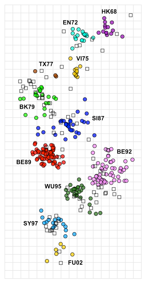
This map was built using a very large dataset of HI data, including 79 antisera and 273 antigens, as a table of raw data it would require a lot of subjective analysis to infer the patterns seen over time, but constructed as an antigenic map, it becomes trivial to see how H3N2 influenza has evolved over time, with antigenic characteristics seeming to change over time in punctuated steps, but with an overall progression of successive, roughly linear, antigenic change, presumably as the virus is pressured to change and continually escape immunity developing in the population.
It even becomes obvious where the virus has done something a little different, as in the case of the SI87, BE89, BE92, WU95 cluster conformation, where for some reason the antigenic variation appears to have departed from its more linear course, creating clusters of strains and sera with more complex patterns of shared reactivity.
We will go into interpreting antigenic maps in more detail later on, including the role and interpretation of serum positions (the open squares in the map above), but hopefully this gives an essence for starters. Not all data is well described by an antigenic map and not all types of antigenic analyses or scientific questions are well suited to it, but used in the right context and as an adjunct to other analyses it can give a powerful visualization of underlying patterns in titration data that might not otherwise be obvious.
What are the advantages?
Ease of interpretation
With the data visualised like this, basic interpretation of large-scale
patterns becomes trivial.
Accuracy
Based on multiple measurements, patterns seen in the map are less biased
by random assay noise.
A better overview
Features such as the trajectory of evolution through antigenic space,
and any tendency for antigenic characteristics to cluster can be seen
more clearly.
Quantification
Antigenic similarity between strains can be quantified, allowing us to
explore how different characteristics (isolation data, genetic
characteristics etc.) relate to antigenic differences.
Predictions
Expected reactivity and immunity can be predicted based on antigenic
position.
What are the drawbacks?
Antigenic maps shouldn’t be relied on alone to interpret titer data, in general you will still require a good understanding of your data and further investigation and understanding of the root of any patterns seen. Alongside development of the method itself, we continue to develop our own methods of map “diagnostics” to check that the data is being well represented, which we will try to continue to share and document, but in general some things to be aware of include:
Oversimplification
The flip-side of the simplified view of antigenic relations that maps
provide is the potential for oversimplification. Where patterns in the
data do not fit relationships in a euclidean space, nuances or even
otherwise clear patterns in the data can be obscured.
Bias
While antigenic maps generally do a good job of accounting for random
assay noise they are still vulnerable to systematic assay bias, for
example if a strain tends to just react with low titers in general in
the assay this will often cause the strain to move away antigenically,
since low serum titers can also be associated with antigenic change.
Effect of outliers
Depending on how much data goes into making a map it can be more or less
vulnerable to outliers in the data. Even maps with quite a lot of data
can be vulnerable to for example the odd sera that just reacts to
everything in the assay for example. This is a good thing to look for
and be aware of.
Map uncertainty
Again, especially with little data, you may see patterns of antigenic
difference suggested in the map but how strongly these differences are
supported by the data can vary, sometimes hinging on reactivity seen in
a single antigen or serum or even titer. We continue to develop methods
like “noisy bootstrapping” of the maps to help better understand the
level of uncertainty in such cases.
From an assay to a map
In general the process of getting from an assay to a map can be summarised as in the figure below:
- Start with a titer table
- Do some conversion of each antigen-serum titer into an expected antigenic distance between them
- Take the resulting distance matrix and applying multi-dimensional scaling to create an n-dimensional (often 2-dimensional) representation of antigen and serum positions on a map.
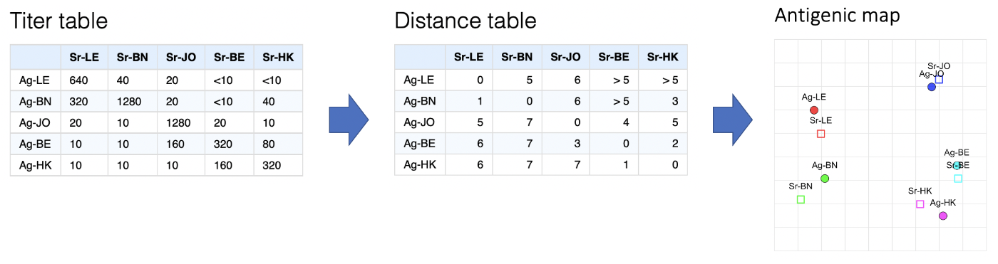
Converting a titer table to a distance table
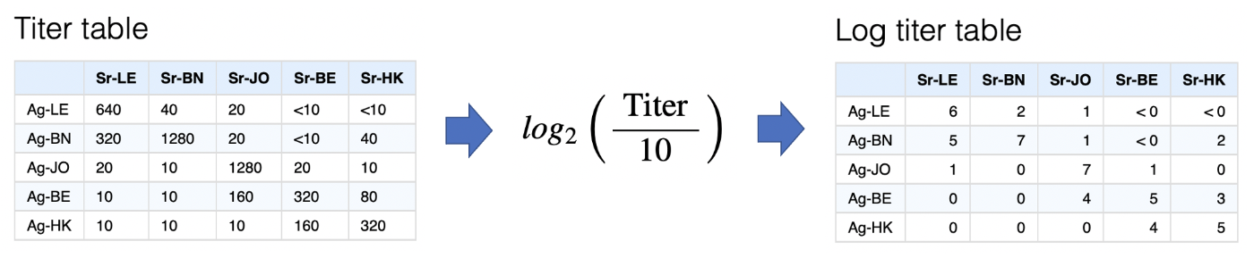
Log titer conversion
The first step is converting titers onto the log scale, via the
transformation below. Other transformations could be used but error in
the HI assay varies approximately normally on the log scale, as do
differences in response magnitude between ferrets so there is some
justification for this.
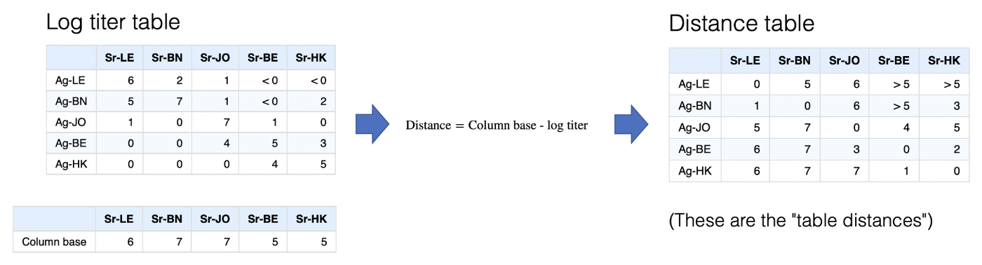
Column bases
The log titer table represents something like a similarity matrix, since
higher values (higher titers) imply greater similarity between a serum
and an antigen. For multidimensional scaling this needs to be converted
to a distance matrix where higher numbers indicate more
dissimilarity.
Simplistically we can reverse the log scale to a distance scale, an antigen with a log titer of 5 would therefore be one unit further away from a sera than an antigen with a log titer of 6 etc. but we still need to decide what should count as a distance of 0, i.e. the maximum closeness of any antigen and serum point.
An obvious approach is to take the maximum titer against each serum and say that any antigen with this maximum titer has a distance of 0, i.e. is as close as you can possibly get to that sera. This is indeed the default, and because the serum form the columns these maximum values in each column are referred to as the “column base”. Once this is defined, transformation to a distance matrix is very straight-forward as shown below.
 Minimum column
basis
Minimum column
basis
At some point in the development of antigenic cartography it became
obvious that occasionally you have a problem when additional sera have
been included in your assay but not titrated against homologous viruses
(i.e. a “BN” sera but no “BN” antigen). Such sera can have very low
titers overall, but not because the ferret had a small overall response,
instead simply because no viruses that were antigenically similar to the
antiserum were included in the panel.
We can see this in the example below if we remove the “BN” antigen from the table. Applying the default method above, the column basis for the “BN” sera then becomes extremely low, and consequently all the antigens, even those with very low titers to the sera, would be inferred as being antigenically very close.
The solution to this problem in the antigenic cartography software is really a bit of a fudge, which is to set a minimum that any column basis can be, the “minimum column basis”. This is set in terms of a raw titer, which is then interpreted on the log scale, hence “640” would be interpreted as a minimum column basis of 6.
An intuitive interpretation of the minimum column basis might be something along the lines of,
“The minimum plausible maximum response size I would expect from any of the ferret (or whatever animal you have) antisera - so if all strains have lower titers than this, it’s probably not because of a low-responding ferret, but rather that none of the strains are antigenically similar to the antiserum response”1
In the example below, we might decide to take that approach to try and compensate for the missing “BN” antigen in the table by setting a minimum column basis of “640”. In this case it has a knock-on effect not only on increasing the assumed column basis for the “BN” sera, but also “BE” and “HK”. The latter two are probably not desirable, but illustrates the way it works.
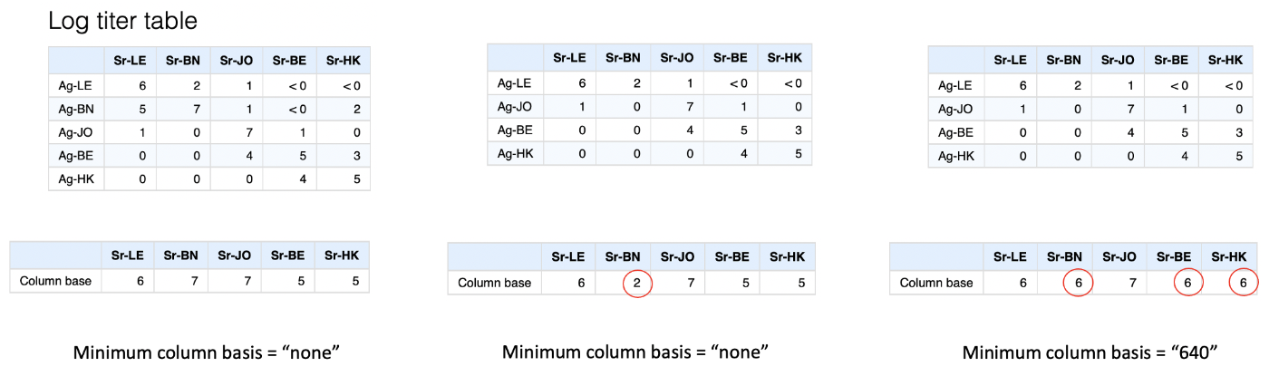
You can probably tell that this is not a pretty way to account for this potential issue, happily in most cases - even if exactly homologous antigens are missing - there are enough antigenically similar viruses that this sort of compensation is not needed and the maximum measured titer is a good representation of what the theoretical “max-response” for that ferret is, but it’s something to be aware of and it’s worth considering if this sort of thing may be an issue in your data.
Converting a distance table to a map
Now we have a distance table we have to convert this to some n-dimensional representation. This process is not uncommon, indeed it is multi-dimensional scaling (MDS).
What is more uncommon is that we will inevitably have multiple missing values in the distance table since what may seem like a full distance table at first is actually at best only half since we have no measure of antigen-antigen or serum-serum distances, as illustrated below.
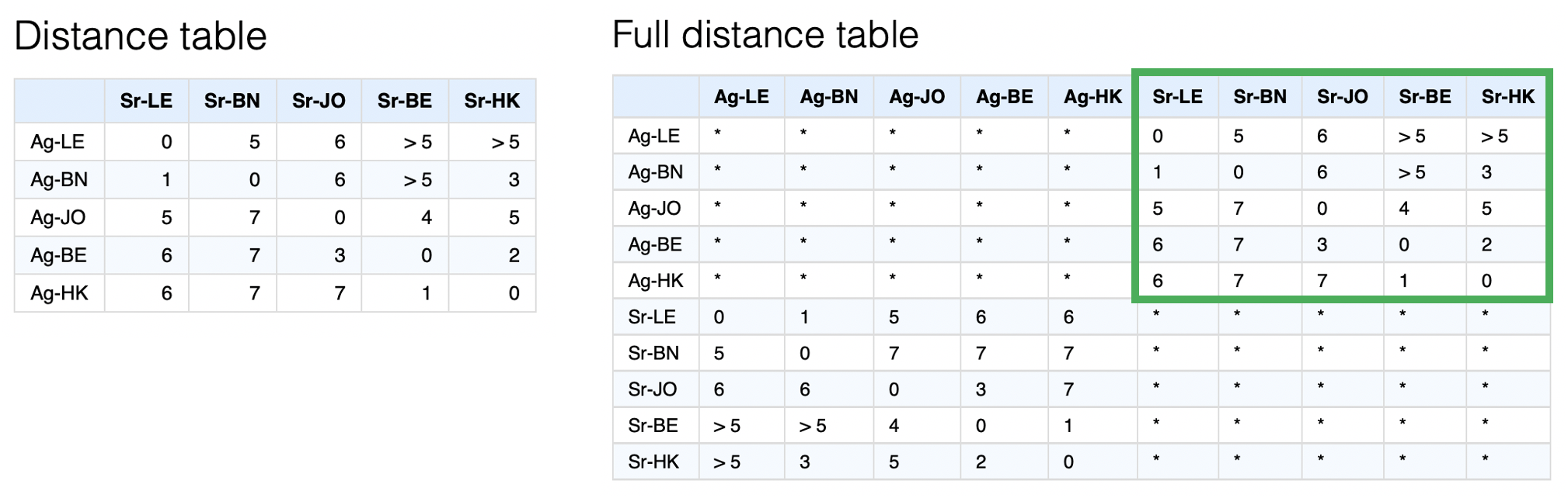
A further complication is that generally there are many thresholded or “censored” titers such as “<10”. These then become similarly censored distances as in the example of multiple “>5” distances. Since we currently know of no MDS implementation that accounts for both missing and censored values2, a custom optimisation routine is used to try and find the best set of map coordinates to represent the distances in the distance matrix most closely.
The steps of this optimisation process are very simple:
- Start with antigens and serum in random positions in n-dimensional space3.
- “relax” the map from these starting conditions using an optimization routine, by default L-BFGS.
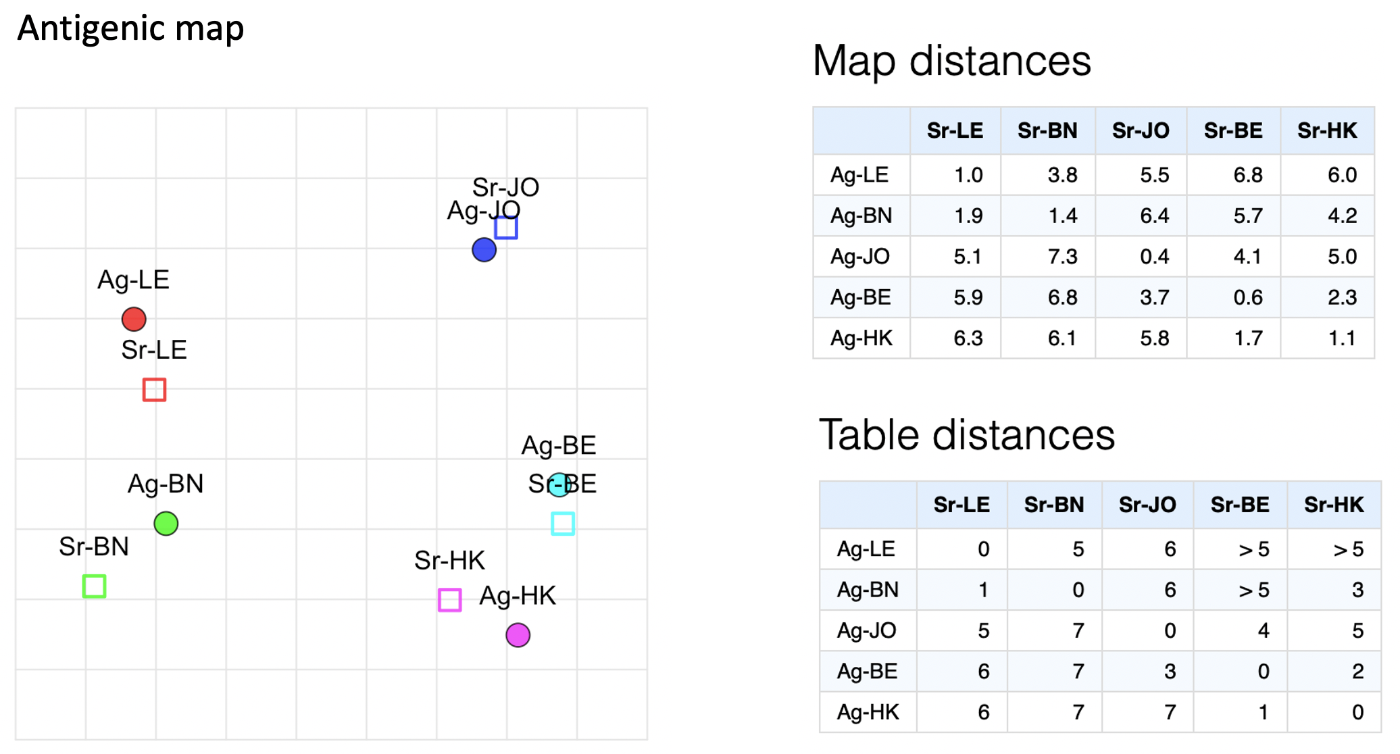
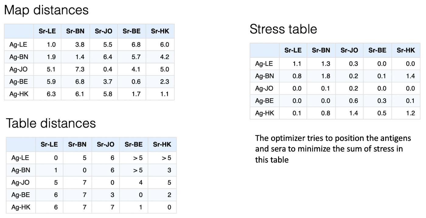
The optimiser aims to optimise the sum of the squared differences between the table distances (those from the original conversion of titer to distance table) and the map distances (straight-line distance between points in the n-dimensional space), as illustrated below.
 More specifically, each
serum-antigen pair has an associated stress calculated as:
More specifically, each
serum-antigen pair has an associated stress calculated as:
where is the point stress, is the table distance and is the map distance.
In the case of censored distances like , table distance would essentially be assumed to be 6 and stress then set to 0 if the map distance is , or (equivalent to the above) if the map distance is .
In actual fact, in order to allow for an analytical solution to the derivative of the stress function - and therefore speed up optimisation - a steep threshold function is used of the form,
An example visualising these calculations as a table of antigen-serum point stresses is given below,
 Dimensional
annealing
Dimensional
annealing
One option in the optimiser is whether to apply dimensional annealing or
not. Dimensional annealing alters the optimisation regime as
follows:
- Start antigen and serum points in a random position in a higher number of dimensions (by default 5)
- “Relax”, using the conjugate gradient algorithm to move points into a local optima of positions
- Reduce the number of dimensions
- Relax and optimize point positions again
- Repeat until desired number of dimensions reached
By first relaxing points in a higher dimensional space, dimensional annealing theoretically prevents points from becoming trapped so easily in local optima in a lower number of dimensions. However we have found that while it is more efficient when doing low numbers of optimization runs, it can also tend to reduce the parameter space that is effectively explored and can actually prevent finding more optimal solutions in some cases. Possibly this is because the higher dimensional optimisation step homogenises different starting conditions too much. For this reason it is not used by default, but can be turned on to see if this improves solutions.
Checking the optimization process
Depending on how many points your map has, it may be more or less difficult to find an optimal solution to the MDS problem of most closely representing a distance table as points in n-dimensional space. For more complex maps it may require more optimization runs from the random starting conditions to have a good chance of finding a more optimal solution.
Of course we will never know if the optimal solution has been found but an important check is whether multiple optimization runs have found similar or the same lowest stress solutions. An ideal situation is that you have done enough runs such that the lowest stress runs are all ending up with similar solutions. If all the lowest stress maps from your optimization runs look quite different it suggests that by doing more optimization runs you may be able to find better solutions.
If you are getting very different maps out every time you run
optimizeMap(), the problem is probably that you aren’t
doing enough optimization runs each time to consistently be chancing
upon what is hopefully ultimately just one lowest-stress solution each
time.
Judging your map
After having done the above you will end up with a map of antigens and sera but you will still need to judge whether it usefully represents the data. This is a big topic and work is ongoing to expand the documentation and code to describe and make more available some of the heuristics we typically employ.
-
You may at this point be wondering what “antigenically similar to the antiserum response” means, well good question. Typically, antigenically similar to the antiserum response, i.e. the antiserum has high titers against it, should translate as “antigenically similar to the antigen against which the antiserum was raised” but one of the paradoxes - at least of ferret serum responses in influenza - is that antiserum can sometimes tell different and contrasting stories of antigenic similarity.
Colloquially put, one serum may “see” an antigenic difference between two strains and one serum may not. In antigenic cartography this is resolved by allowing serum points to be separate from antigen points, allowing for example the sera that sees no difference between antigens to be in the middle of them and therefore equidistant, while others that see a difference can be closer to the one they have higher titers to. Whether varying serum position like this in euclidean space is the best way to represent such differences is of course debatable but seems in most circumstances to represent observed patterns of reactivity quite well.↩︎
Please get in touch if you do!↩︎
In order to determine the size of this space, first the maximum distance for a table is found, then the points are randomised using that distance as a hyper-cube side length and relaxed with a very rough optimisation precision. The distance between farthest points of the resulting map is found and then that distance is multiplied by some value (2.0 by default) and the result is used as the hyper-cube side length for the specified number of randomisations.↩︎